AICHI METAL
Case Studies
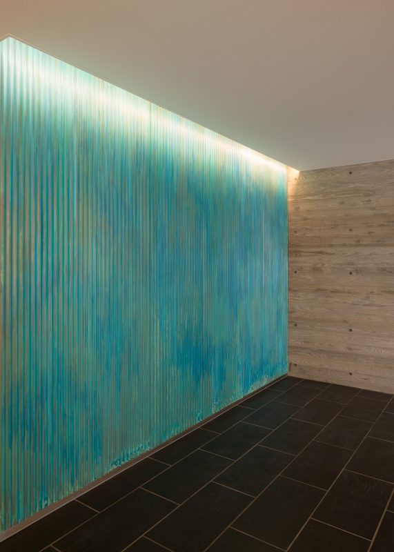
Some ancient shrines, temples, and buildings have roofs and pillars made of copper. It can be inferred that these were beautiful copper colors when they were first constructed, but over time they have developed a greenish-blue appearance that gives them a more unique and appealing character. This is one of the great charms of the aging process of copper. The greenish-blue is rust that occurs in the copper component. It is basically harmless. In the past, green rust was considered toxic, but it has been shown to be harmless in terms of composition. At the same time, it is now known that green rust forms a film that protects metals from corrosion. The look that copper with green patina gives has attracted attention, and today, copper with green patina can be used from the time of completion of construction.
I'm talking about dreams
This project involved the production of a huge partition at the entrance. The art wall is made of tin coated with Verometal® Copper and decorated with a greenish-blue finish. The same finished material was used for the intercom controls, giving a light impression to the building. The presence of the metal is maintained, while the beautiful patina is enjoyed dynamically. In addition, the handrail in front of the intercom system is coated with Verometal® Copper on the inside only, creating a greenish-blue color. You can also enjoy the look of the copper as it slowly turns a deep candy color. The use of Verometal® allows us to provide stable quality even over large areas. Of course, achieving a uniform finish and careful decorative treatment over a large area requires skillful techniques. Even the slightest irregularity in application will not result in uniform greenish-blue. The larger the area, the more skill is required to apply VeroMetall® coatings and decorations. Conversely, if you want to create "intentional irregularities," you must have the skill to control the entire process.
essence
The presence of green and blue is outstanding, but it therefore requires a deep knowledge of interior design. For example, in this project, the logo is placed in the center of the art wall. Naturally, visibility of the logo is important. It is also important that the entire wall serves as a complement to the logo. Therefore, we have installed the logo processed with metal while slightly reducing the occurrence of green-blue around the logo. By setting up the lighting, etc., the design of the space as a whole, the visibility of the logo, and its role as a signboard with the presence of the greenish-blue color will stand out. These techniques are the work of the design side. As a material supplier, it is important for us to understand their intentions and translate them into the finished product. Greenish-blue is beautiful and full of individuality. That is why we are always reminded of how to handle it.